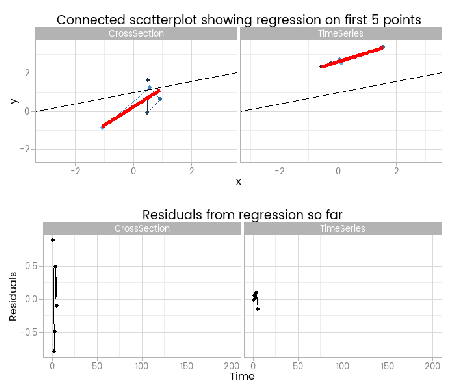
For training purposes I wanted to illustrate the dangers of ignoring time series characteristics of the random part of a classical linear regression, and I came up with this animation to do it:
I like this, because it shows how easy it is to fit something that looks to be a good fit but actually misses important parts of reality. The red lines show where the fitted model is, based on a small window of the data – from 5 to 200 points. The black line shows the true data generating process. From very early on the model fit to the simple cross-sectional has converged to pretty close to the black line. However, the model fit to the data with time series errors spends a long time greatly overestimating the value of one of the parameters in the model, and not until there are 120 observations has it converged to anywhere near the true process.
At the very least, it shows that you need many more – four times as many in this case, but unfortunately that’s not a magic number that will always work – observations from a time series to reliably estimate the structural part of a model. Even if we’d explicitly modelled the time series part of the data on the right of the animation, we’d still have that problem.
By including the residual plots below the scatter plots we get a nice picture of a warning sign in this basic (and should be fundamental and universal) diagnostic plot. In this particular case the pattern is obvious; when working with real data you should check with partial autocorrelation function plots too.
Simulating data
The animation illustrates the results of simulating and contrasting two fairly extreme cases:
- cross section data, generated exactly from a model of y = a …read more
Source:: r-bloggers.com
